The StatusStrip Control
- Details
- Written by David Corrales
- Last Updated: 15 June 2016
- Created: 12 September 2012
- Hits: 23659
StatusStrip [System.Windows.Forms.StatusStrip]
Represents a Windows status bar control.
![]()
Default Event: ItemClick
Why use a StatusStrip control?
Use the StatusStrip control, to display status information to the user. The StatusStrip serves as a replacement to the StatusBar and also offers more support for user interaction than the StatusBar by allowing you to add buttons, progress bars, and other controls.
Note: The StatusStrip control is only available for PowerShell Studio v3.0.6 or greater
Important Properties:
AllowItemReorder
This property allows the items in the StatusStrip to be reordered when the ALT key is pressed.
SizingGrip
This property indicates whether a sizing handle (grip) is displayed in the lower-right corner of the control. This property is mainly cosmetic and should be set to False when using fixed sized forms, such as when the form’s FormBorderStyle property is set to FixedDialog. For more details about the Form control and the FormBorderStyle property, please refer to the Spotlight on the Form Control article.
Default Value: True
![]()
ShowItemToolTips
This property indicates whether ToolTips are shown for the StatusStrip. Set this property to True when you want to provide help information for items in the StatusStrip.
Default Value: False

LayoutStyle
This property indicates how the StatusStrip lays out the items collection.
Values (Default: Table):
StackWithOverflow
Specifies that items are laid out automatically.
HorizontalStackWithOverflow
Specifies that items are laid out horizontally and overflow as necessary.
VerticalStackWithOverflow
Specifies that items are laid out vertically, are centered within the control, and overflow as necessary.
Flow
Specifies that items flow horizontally or vertically as necessary.
Table
Specifies that items are laid out flush left.
Note: If you want to ensure all the items on the status bar are visible even when the form is resized then you can use the Flow layout style:

Otherwise the items that do not fit in the StatusStrip (depending on form size) will be hidden from view.
Dock
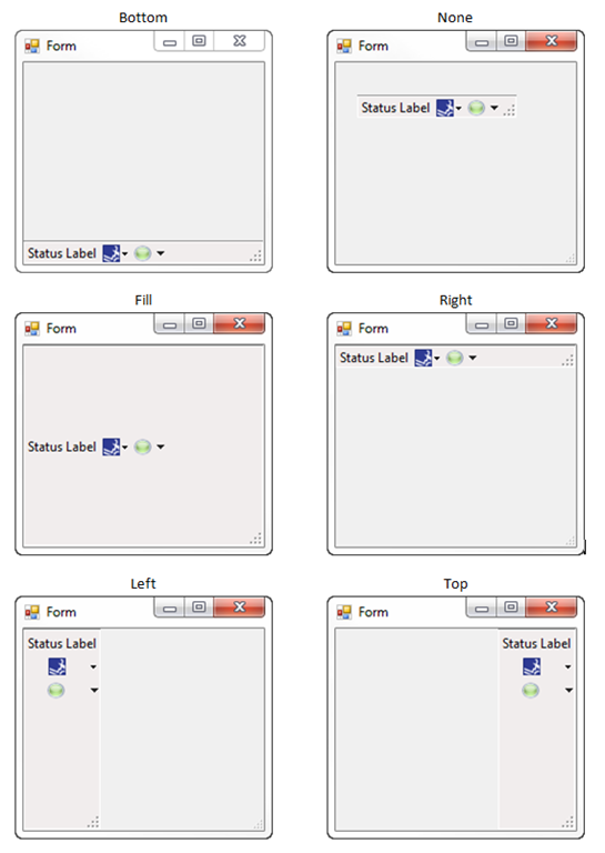
This property indicates which StatusStrip borders are docked to its parent control and determines how a StatusStrip is resized with its parent.
Values (Default: Bottom):
None
The control is not docked. The StatusStrip becomes a free floating control that cannot be moved by the user.
Top
The control’s top edge is docked to the top of its containing control.
Bottom
The control’s bottom edge is docked to the bottom of its containing control.
Left
The control’s left edge is docked to the left edge of its containing control.
Right
The control’s right edge is docked to the right edge of its containing control.
Fill
All the control’s edges are docked to the all edges of its containing control and sized appropriately.
Items
This property contains all the items that belong to the StatusStrip. This property consists of a collection of ToolStripItems, which come in various flavors. For more information, refer to the ToolStripItem Types section below.
Adding Items to the StatusBar
Using the Designer:
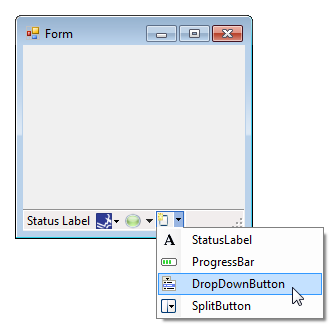
You can add ToolStripItems directly in the designer by accessing the dropdown inside the StatusStrip:
Note: To edit the item’s properties you will have to select the ToolStripItem and use the Property Panel.
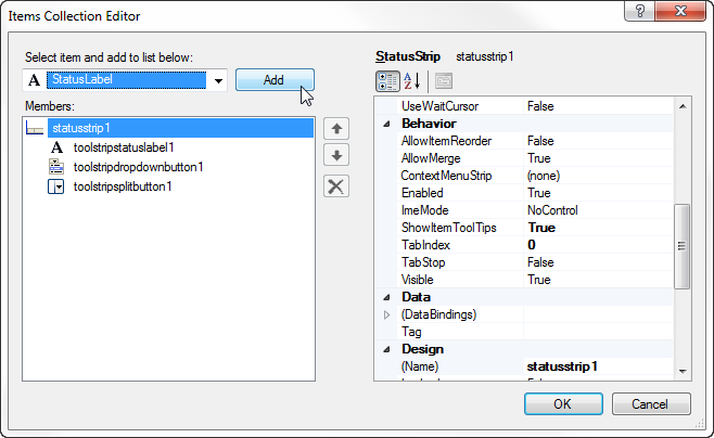
You can also use the Item Collection Editor to add items to the StatusStrip.
Access the Item Collection Editor using the property panel:
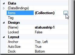
Or the by using the designer menu:
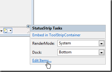
The Item Collection Editor allows you to add / remove ToolStripItems and alter their properties in a single location:
Using the Script Editor:
You can add ToolStripItems using the Item property’s Add methods:
[ToolStripItem] Add ([Image] image)
Adds a ToolStripItem that displays the specified image to the collection.
[ToolStripItem] Add ([String] text)
Adds a ToolStripItem that displays the specified text to the collection.
[int] Add ([ToolStripItem] value)
Adds the specified item to the end of the collection.
[ToolStripItem] Add ([String] text, [Image] image)
Adds a ToolStripItem that displays the specified image and text to the collection.
[ToolStripItem] Add ([String] text, [Image] image, [EventHandler] onClick)
Adds a ToolStripItem that displays the specified image and text to the collection and that raises the Click event.
Example Code:
$clickEvent = {
    Write-Host 'Click'
}

$image = [System.Drawing.Image]::FromFile('c:\image.png')

$statusstrip1.Items.Add('Text', $image , $clickEvent)
Important Events:
ItemClicked
This event occurs when a ToolStripItem is clicked. This event allows you to handle all the click events in one location, but it is not recommend using this event if you are have DropDownButtons or SplitButtons. Instead you should use each ToolStripItem’s individual event handlers.
$statusstrip1_ItemClicked=[System.Windows.Forms.ToolStripItemClickedEventHandler]{
#Event Argument: $_ = [System.Windows.Forms.ToolStripItemClickedEventArgs]

    Write-Host $_.ClickedItem.Text

    if($_.ClickedItem -eq $toolstripstatuslabel1)
    {
        Write-Host "You clicked the label"
    }
}
ToolStripItem Types:
You can add a variety of items to the StatusStrip, which are presented below.
The following properties are shared with all the types of ToolStripItems, with the exception of the ProgressBar which only shares the ToolTipText property:
Important Shared Properties:
| Property | Description |
| ToolTipText |
Specifies the text to show on the Tooltip. |
| DisplayStyle | Specifies whether text and images are displayed on an item. Values:
None Text
Image
ImageAndText
|
| Image | The image that will be displayed on the item. |
| ImageScaling | Indicates whether the image on the item will automatically resize to fit in the StatusStrip. Values:
None
SizeToFit
|
| Text | The text that is to be displayed on the item. |
| TextImageRelation | The position of the item’s text and image relative to each other. Values:
Overlay
ImageBeforeText TextBeforeImage ImageAboveText TextAboveImage |
| DoubleClickEnabled | Indicated whether the item can be activated by double-clicking the mouse. Values: True / False |
Important Shared Events:
The following events are shared with all the types of ToolStripItems:
| Event | Description |
| Click | Occurs when the item is clicked. |
| DoubleClick | Occurs when the item is clicked. Note: Order for this event to be triggered, some types require that the DoubleClickEnabled property to be set to True. |
The following is a list of ToolStripItems types that can be added to the StatusStrip control:
StatusLabel [System.Windows.Forms.ToolStripStatusLabel]
![]()
Represents a panel in a StatusStrip control. Use the StatusLabel to show text and/or an image.
Important Properties:
| Properties | Description |
| BorderSides | Indicates which sides of the ToolStripStatusLabel show borders. Values: None, Top, Left, Right, Bottom, All |
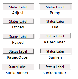
| BorderStyles | Indicates the border style of the ToolStripStatusLabel.
Values (Default: Flat): Adjust Bump Etched Flat Raised RaisedInner RaisedOuter Sunken SunkenInner SunkenOuter
|
| Spring | Indicates whether the ToolStripStatusLabel automatically fills the available space on the StatusStrip as the form is resized.
Values: True / False |
| IsLink | Indicated whether the ToolStripLabel is a hyperlink.
Values: True / False
|
| LinkBehavior | Indicates the behavior of a link.
Values (Default: SystemDefault): SystemDefault AlwaysUnderline HoverUnderline NeverUnderline |
Making a Link Functional:
In order to have the Label open a webpage you will need to handle the label’s Click event:
$toolstripstatuslabelLink_Click={
    #Open the URL in the Default Application
    [System.Diagnostics.Process]::Start($this.Text)
}
In the case where you don’t want the text to show the actual link, you can instead store the link in the label’s Tag property:

And modify the Click event as follows:
$toolstripstatuslabelLink_Click={
    #Show the URL stored in the TAG property
    if($this.Tag -is [string])
    {
        [System.Diagnostics.Process]::Start($this.Tag)
    }
}
ProgressBar [System.Windows.Forms.ToolStripProgressBar]
![]()
Represents a Windows progress bar control contained in a StatusStrip. Use the Progress bar to show the total progress of an operation.
Important Properties:
| Properties | Description |
| Maximum | The upper bound of the range that is defined for this ToolStripProgressBar. |
| Minimum | The lower bound of the range that is defined for this ToolStripProgressBar. |
| Step | The amount by which to increment the current value of the ToolStripProgressBar when the PerformStep method is called. |
| Value | Indicates the current value of the ToolStripProgressBar. |
Please refer to the Spotlight on the ProgressBar Control article for more details on the progress bar.
DropDownButton [System.Windows.Forms.ToolStripDropDownButton]

Represents a button that when clicked displays an associated menu from which the user can select a single item.
Important Properties:
| Properties | Description |
| DropDown | Specifies a ToolStripDropDown (such as a ContextMenuStrip) that will be displayed when this item is clicked. |
| DropDownItems | Specifies a ToolStripItem to display when this item is clicked. |
| ShowDropDownArrow | Specifies whether an arrow is displayed on the item, which indicates that further options are available in a drop-down list. |
Important Events:
| Properties | Description |
| DropDownItemClicked | Occurs when the ToolStripDropDown is clicked. |
$toolstripdropdownbutton2_DropDownItemClicked=[System.Windows.Forms.ToolStripItemClickedEventHandler]{
#Event Argument: $_ = [System.Windows.Forms.ToolStripItemClickedEventArgs]
    Write-Host $_.ClickedItem.Text
}
Please refer to the Spotlight on the ContextMenuStrip Control article for more details on the menus.
Making an ordinary button:

In order to make a DropDownButton function like an ordinary button, you must do the following:
1. Set the ShowDropDownArrow property to False.
2. Clear any DropDown Items from the button.
3. Create an event handler for the DropDownButton’s Click event.
SplitButton [System.Windows.Forms.ToolStripSplitButton]
Represents a combination of a standard button on the left and a drop-down button on the right, or the other way around if the value of RightToLeft is Yes.
Important Properties:
| Properties | Description |
| DropDown | Specifies a ToolStripDropDown (such as a ContextMenuStrip) that will be displayed when this item is clicked. |
| DropDownItems | Specifies a ToolStripItem to display when this item is clicked. |
Important Events:
| Properties | Description |
| Click | Occurs when the button is clicked. |
| DropDownItemClicked | Occurs when the ToolStripDropDown is clicked. |
Please refer to the Spotlight on the ContextMenuStrip Control article for more details on the menus.
For licensed customers, use the forum associated with your product in our Product Support Forums for Registered Customers.
For users of trial versions, please post in our Former and Future Customers - Questions forum.


