The ErrorProvider Control
- Details
- Written by David Corrales
- Last Updated: 15 June 2016
- Created: 11 August 2011
- Hits: 28477
ErrorProvider Control [System.Windows.Forms.ErrorProvider]
Provides a user interface for indicating that a control on a form has an error associated with it.
![]()
Default Event: N/A
Why use a ErrorProvider control?
Use the ErrorProvider if you want to notify the user that there is an input error by flashing an icon next to the input control. You can use a single ErrorProvider for multiple controls. In the case where you wish to display different icons or styles, you will need to use multiple ErrorProvider controls.
Important Properties:
Icon
Use this property to change the icon used to indicate an error.
Default Icon: ![]()
BlinkRate
This property controls the rate in milliseconds at which the error icon blinks.
Use this property to increase or decrease the blink rate of the icon. Note: 1000 milliseconds = 1 sec.
Default Value: 250
BlinkStyle
This property controls whether the error icon blinks when an error is set.
Values (Default: BlinkIfDifferentError):
BlinkIfDifferentError
Blinks when the icon is already displayed and a new error string is set for the control.
AlwaysBlink
Always blinks when the error icon is first displayed, or when an error description string is set for the control and the error icon is already displayed.
NeverBlink
Never blinks the error icon.
Important Methods:
SetError
This method sets the error description string for the specified control.
Use the SetError method to display the error icon next to the target control and display a specified error message when the user hovers the mouse over the error icon. To clear an error message, pass an empty string to the method, using the same control as a parameter.
Example use of the SetError method when validating a TextBox:
$textboxName_Validating=[System.ComponentModel.CancelEventHandler]{
#Event Argument: $_ = [System.ComponentModel.CancelEventArgs]
    #Check if the Name field is empty
    if($textboxName.Text.Trim() -eq "")
    {
        #Display an error message
        $errorprovider1.SetError($textboxName, "Please enter your name.");
    }
    else
    {
        #Clear the error
        $errorprovider1.SetError($textboxName, "");
    }
}
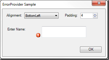
The ErrorProvider displayed in the form:

SetIconAlignment
This method sets the location where the error icon should be placed in relation to the control.
Note: You have to set the alignment for each individual control.
Note: You can set also set the Icon Alignment in the designer by setting the target control’s “IconAlignment on errorprovider1” property.
An example use of the SetIconAlignment method where the error Icon is set on the left side of the TextBox control:
$errorprovider1.SetIconAlignment($textboxName, [System.Windows.Forms.ErrorIconAlignment]::MiddleLeft)
The resulting form:
![]()
The second parameter of the method accepts an enum of type [System.Windows.Forms.ErrorIconAlignment]. Since PowerShell allows you to express enum values as strings, you can shorten the call by just passing the name of the ErrorIconAlignment value:
$errorprovider1.SetIconAlignment($textboxName, "MiddleLeft")
Default Alignment: MiddleRight
ErrorIconAlignment Values:
TopLeft
The icon appears aligned with the top of the control and to the left of the control.
TopRight
The icon appears aligned with the top of the control and to the right of the control.
MiddleLeft
The icon appears aligned with the middle of the control and the left of the control.
MiddleRight
The icon appears aligned with the middle of the control and the right of the control.
BottomLeft
The icon appears aligned with the bottom of the control and the left of the control.
BottomRight
The icon appears aligned with the bottom of the control and the right of the control.
SetIconPadding
Sets the amount of extra space left between the specified control and the error icon.
Note: You have to set the padding for each individual control.
$errorprovider1.SetIconPadding($textboxName, 1)
Note: You can set also set the Icon Padding in the designer by setting the target control’s “IconPadding on errorprovider1” property.
ErrorProvider with padding set to 1:

ErrorProvider with the padding set to 10:

Download the ErrorProvider Sample.

For licensed customers, use the forum associated with your product in our Product Support Forums for Registered Customers.
For users of trial versions, please post in our Former and Future Customers - Questions forum.


