The ListView Control
- Details
- Written by David Corrales
- Last Updated: 23 January 2017
- Created: 04 April 2012
- Hits: 79196
ListView [System.Windows.Forms.ListView]
Represents a Windows list view control, which displays a collection of items that can be displayed using one of four different views.
![]()
Default Event: SelectedIndexChanged
Why use a ListView control?
The ListView is a hybrid display. It is more complex then a ListBox, but also can display data similar to a grid. A ListView control allows you to display a list of items with item text and, optionally, an icon to identify the type of item. For example, you could use the ListView to display icons in a similar fashion to the Window’s File Explorer.
See also: How to add icons to a ListView.
Important Properties:
View
This property indicates how items are displayed in the control. Use this property to set the style or view of the ListView control.
Select from the following views:
LargeIcon
Each item appears as a full-sized icon with a label below it.
Details
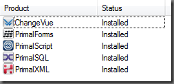
Each item appears on a separate line with further information about each item arranged in columns. The left-most column contains a small icon and label, and subsequent columns contain sub items as specified by the application. A column displays a header which can display a caption for the column. The user can resize each column at run time.
SmallIcon
Each item appears as a small icon with a label to its right.
List
Each item appears as a small icon with a label to its right. Items are arranged in columns with no column headers.
Tile
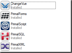
Each item appears as a full-sized icon with the item label and subitem information to the right of it. The subitem information that appears is specified by the application. This view is available only on Windows XP and the Windows Server 2003 family. On earlier operating systems, this value is ignored and the ListView control displays in the LargeIcon view.
Note: Some properties only pertain to particular views. The compatible views will be listed in each property’s description.
Alignment
This property indicates how items are aligned within the ListView.
Compatible Views: SmallIcon, LargeIcon
Default Value: Top
Default
When the user moves an item, it remains where it is dropped.
Top
Items are aligned to the top of the ListView control.
Left
Items are aligned to the left of the ListView control.
SnapToGrid
Items are aligned to an invisible grid in the control. When the user moves an item, it moves to the closest juncture in the grid.
AllowColumnReorder
This property indicates whether the user can reorder column headers in the Details view. Set this property to True, the users the order of the column header, by dragging the header to the desired location.
Compatible Views: Details
Default Value: False
CheckBoxes
This property indicates whether a check box appears next to each item in the control.
Compatible Views: All except Tile
Default Value: False
When CheckBoxes is set to True, use the ItemChecked event to respond to an item’s checked state changes.
Columns
This property contains a collection of column headers that are displayed in the Details view.
Compatible Views: Details
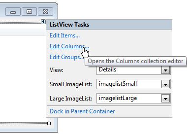
You can access the ColumnHeader Collection Editor via the designer:
Or you can access the ColumnHeader Collection Editor via the Property Pane:

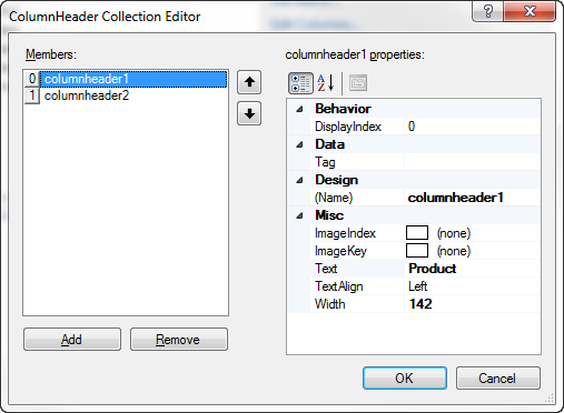
The ColumnHeader Collection Editor allows you to add / remove Columns as well as modify their properties:
The Columns collection is made up of the following object:
ColumnHeader [System.Windows.Forms.ColumnHeader ]
Property Description DisplayIndex This property indicates the display order of the column relative to the currently displayed columns ImageIndex This property indicates the index of the image displayed in the ColumnHeader. Text This property contains the text displayed in the column header. TextAlign This property determines the horizontal alignment of the text displayed in the ColumnHeader.
Values (Default: Left):
Left
The object or text is aligned on the left of the control element.Right
The object or text is aligned on the right of the control element.Center
The object or text is aligned in the center of the control element.Width This property determines the width of the column.
Set Width = -1, to adjust the width of the longest item in the column.
Set Width = -2, to auto size to the width of the column heading.
Note: When setting these special values, the control will automatically replace the Width with the calculated value.
You can use the Column’s Add method to add Columns via the script editor:
Add Methods:
[int] Add ([ColumnHeader] value)
Adds an existing ColumnHeader to the collection.
[ColumnHeader] Add ([String] text)
Creates and adds a column with the specified text to the collection.
[ColumnHeader] Add ([String] text, [int] width)
Creates and adds a column with the specified text and width to the collection.
[ColumnHeader] Add ([String] key, [String] text)
Creates and adds a column with the specified text and key to the collection.
[ColumnHeader] Add ([String] text, [int] width, [HorizontalAlignment] textAlign)
Adds a column header to the collection with specified text, width, and alignment settings.
[ColumnHeader] Add ([String] key, [String] text, [int] width)
Creates and adds a column with the specified text, key, and width to the collection.
[ColumnHeader] Add ([String] key, [String] text, [int] width, [HorizontalAlignment] textAlign, [int] imageIndex)
Creates and adds a column with the specified key, aligned text, width, and image index to the collection.
[ColumnHeader] Add ([String] key, [String] text, [int] width, [HorizontalAlignment] textAlign, [String] imageKey)
Creates and add s a column with the specified key, aligned text, width, and image key to the collection.
Example Use:
$columnApplication = $listview1.Columns.Add("Application")
$columnInstalled = $listview1.Columns.Add("Installed")
FullRowSelect
This property indicates whether all sub items are highlighted along with the item when selected.
Compatible Views: Details
Default Value: False
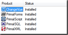
Selection without FullRowSelect:
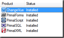
Selection with FullRowSelect:
GridLines
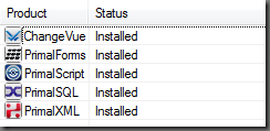
This property indicates whether grid lines appear between the rows and columns containing the items and sub items in the control. The grid lines are only shown when in Details view.
Compatible Views: Details
Groups
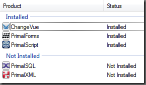
This property contains a collection of ListViewGroup objects that are used by the control. Groups are very useful to display items in categories within the ListView.
Note: If there are groups defined and a item has no group set, it will go into the “Default” group.
Compatible Views: All except the List
You can access the Group Collection Editor via the Designer:
Or via the Property Pane:
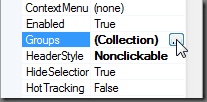
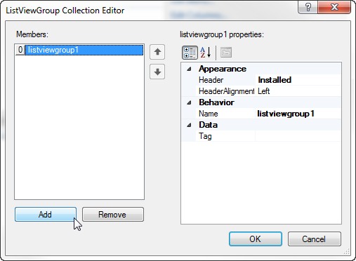
The ListViewGroup Collection Editor allows you to add / remove groups:
The Group collection is made up of the following object:
ListViewGroup [System.Windows.Forms.ListViewGroup]
Property Description Header This property sets the header text for the group. HeaderAlignment This property sets the alignment of the group header text.
Values (Default: Left):
Left
The object or text is aligned on the left of the control element.
Right
The object or text is aligned on the right of the control element.
Center
The object or text is aligned in the center of the control element.
Adding groups via the Script Editor:
[int] Add ([ListViewGroup] group)
Adds the specified ListViewGroup to the collection.
[ListViewGroup] Add ([String] key, [String] headerText)
Adds a new ListViewGroup to the collection using the specified values to initialize the Name and Header properties
Example Use:
$listview1.Groups.Add("InstallGroup", "Installed")
ShowGroups
This property indicates whether items are displayed in groups.
Compatible Views: Details, LargeIcon, SmallIcon, Tile
Default Value: True
HeaderStyle
This property indicated the style of the column headers in the Details view. Use this property when you want to prevent the users from having the option to click on the headers. Typically you would want to sort the items when a user clicks on the header. You can respond to a header click by using the ListView’s ColumnClick event.
Compatible Views: Details
Values (Default: Clickable):
None
The column header is not displayed in report view.
Nonclickable
The column headers do not respond to the click of a mouse.
Clickable
The column headers function like buttons and can carry out an action, such as sorting, when clicked.
HideSelection
This property indicates whether the selected item in the control remains highlighted when the control loses focus.
Compatible Views: All
HotTracking
This property indicates whether the text of an item or subitem has the appearance of a hyperlink when the mouse pointer passes over it.
Enabling hot tracking will cause the Activation property to be set to OneClick and the HoverSelection property to be set to true. In addition, run-time label editing is not allowed when hot tracking is enabled.
Compatible Views: All
Default Value: False
LabelEdit
This property indicates whether the user can edit the labels of items in the control. Use the BeforeEditLabel and AfterEditLabel events in order react to when a user changes a label.
Compatible Views: All
Default Value: False
LargeImageList
This property contains the ImageList control used by the ListView for images in Large Icon view. For more information about the ImageList control, see See the Spotlight on the ImageList Control and How to add icons to a ListView.
Note: The index of the corresponding SmallImageList should be the same as the LargeImageList.
Compatible Views: LargeIcon
SmallImageList
This property contains the ImageList control used by the ListView for images in all views except for the Large Icon view. For more information about the ImageList control, see See the Spotlight on the ImageList Control and How to add icons to a ListView.
Compatible Views: SmallIcon, Detail, List, Tile
StateImageList
This property contains the ImageList control used by the ListView for custom states.
Note: If an ImageList is specified in the StateImageList property and the CheckBoxes property is set to true, the images at index positions 0 and 1 in the ImageList are displayed instead of the check box. The image at index position 0 is displayed instead of the unchecked check box, and the image at index position 1 is displayed instead of the checked check box.
Compatible Views: All
MultiSelect
This property indicating whether multiple items can be selected. If this property is set to true, use the SelectedItems property to determine which items are selected.
Compatible Views: All
Default Value: True
ShowItemToolTips
This property indicates whether ToolTips are shown for the ListViewItem objects contained in the ListView.
Compatible Views: All
Default Value: False
Sorting
This property indicates the manner in which items are to be sorted.
Default Value: None
None
The items are not sorted.
Ascending
The items are sorted in ascending order.
Descending
The items are sorted in descending order.
Compatible Views: All
SelectedItems
This property contains all the items that are selected in the ListView. Note: Each item is a ListViewItem object, so you will have to use the Text property to display the name. The ListViewItem will be addressed in Part 2.
#Display Selected Items
foreach($itemin$listview1.SelectedItems)
{
   Write-Host $item.Text
}
Items
This property contains a collection of all the items in the ListView. All items in a ListView are represented by a ListViewItem object:
ListViewItem [System.Windows.Forms.ListViewItem]
Adding Items to the ListView:
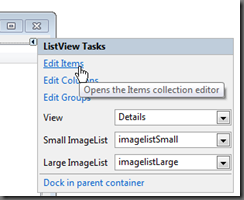
You can access the Items Collection Editor via the Designer:
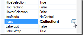
Or via the Property Pane:
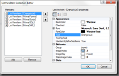
The ListViewItem Collection Editor allows you to add / remove Item as well set their properties:
Via the Script Editor:
[ListViewItem] Add ([ListViewItem] value)
Adds an existing ListViewItem to the collection.
[ListViewItem] Add ([String] text)
Creates an item with the specified text and adds it to the collection.
[ListViewItem] Add ([String] text, [Int] imageIndex)
Creates an item with the specified text and image and adds it to the collection.
[ListViewItem] Add ([String] text, [String] imageKey)
Creates an item with the specified text and image and adds it to the collection.
[ListViewItem] Add ([String] key, [String] text, [Int] imageIndex)
Creates an item with the specified key, text, and image and adds an item to the collection.
[ListViewItem] Add ([String] key, [String] text, [String] imageKey)
Creates an item with the specified key, text, and image and adds an item to the collection.
Example Use:
$listitem = $listview1.Items.Add(‘PowerShell Studio’ , 2)
Adding SubItems:
In the cases where you wish to add SubItems to the ListView you can add them using:
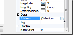
Via the ListViewItem Collection Editor:
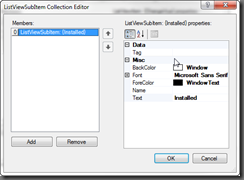
By clicking on the SubItems property in the ListViewItem Collection Editor, you will be presented with a ListViewSubItem Collection Editor.
The only important property you need to set for a ListViewSubItemis the Text property.
Via the Script Editor:
The SubItems property has the following methods to add ListViewSubItems:
[ListViewSubItem] Add ([ListViewSubItem] item)
Adds an existing ListViewItem.ListViewSubItem to the collection.
[ListViewSubItem] Add ([String] text)
Adds a subitem to the collection with specified text.
[ListViewSubItem] Add ([String] text, [Color] foreColor, [Color] backColor, [Font] font)
Adds a subitem to the collection with specified text, foreground color, background color, and font settings.
Example Use:
$subItem = $listitem.SubItems.Add('Installed')
Important Methods:
Clear
This method removes all items and columns from the ListView.
$listview1.Clear()
BeginUpdate
This method prevents the control from drawing until the EndUpdate method is called. Use this method when you are updating or adding a large amount of items.
$listview1.BeginUpdate()
EndUpdate
This method resumes drawing of the list view control after drawing is suspended by the BeginUpdate method.
$listview1.EndUpdate()
Example use of the BeginUpdate and EndUpdate:
$listview1.BeginUpdate()
$listview1.Items.Clear();
foreach($itemin$array)
{
    [void]$listview1.Items.Add($item.Text)
}
$listview1.EndUpdate();
Important Events:
AfterLabelEdit
This event occurs when the label for an item has been edited by the user. Label editing must be enabled for this event to be called (See LabelEdit property).
AfterLabelEdit event uses the following argument, which is accessible via the $_ variable:
[System.Windows.Forms.LabelEditEventHandler]
Properties Description CancelEdit Gets or sets a value indicating whether the edit has been canceled. Label Gets the new text assigned to the label of the ListViewItem. Item Gets the zero-based index of the ListViewItem containing the label to edit.
Use this event to react to name changes. For example if the represents a file, you can use this event as a trigger for renaming the file. You should also perform any validation and reject the name change if there is a failure.
$listview1_AfterLabelEdit=[System.Windows.Forms.LabelEditEventHandler]{
    #Event Argument: $_ = [System.Windows.Forms.LabelEditEventArgs]
    if(-not (Validate-FileName$_.Label))
    {
        $_.CancelEdit =$true
    }
    else
    {
        #Rename the file
    }
}
BeforeLabelEdit
This event occurs when the user starts editing the label of an item.
This event uses the [System.Windows.Forms.LabelEditEventHandler] argument. See AfterLabelEdit for more information about this argument.
Use this event to prevent users from renaming specific items.
$listview1_BeforeLabelEdit=[System.Windows.Forms.LabelEditEventHandler]{
    #Event Argument: $_ = [System.Windows.Forms.LabelEditEventArgs]
    if(-not$listview1.Items[$_.Item].Checked)
    {
        $_.CancelEdit =$true
    }
}
ColumnClick
This event occurs when the user clicks a column header within the list view control. Typically you will use this event to sort the list by the selected column.
ColumnClick event uses the following argument, which is accessible via the $_ variable:
[System.Windows.Forms.ColumnClickEventArgs]
Properties Description Column Gets the zero-based index of the column that is clicked.
$listview1_ColumnClick=[System.Windows.Forms.ColumnClickEventHandler]{
    #Event Argument: $_ = [System.Windows.Forms.ColumnClickEventArgs]
    Write-Host ("Column '{0}' was clicked" -f $this.Columns[$_.Column].Text)
}
See Sorting ListViewItems for how to sort columns.
ItemActivate
This event occurs when an item is activated. One or more items can be activated by the user, depending on the Activate property. Note: Activating an item is not the same as selecting an item. For example, you may want to display a webpage when the user activates an item in the ListView. Use the SelectedItems or SelectedIndices property to referenced the activated item.
$listview1_ItemActivate={
    #TODO: Place custom script here
    Write-Host "Activate Item" $listview1.SelectedItems[0].Text
}
ItemChecked
This event occurs when the checked property of a ListView item changes.
ItemChecked event uses the following argument, which is accessible via the $_ variable:
[System.Windows.Forms.ItemCheckedEventArgs]
Properties Description Item Gets the ListViewItem whose checked state is changing.
$listview1_ItemChecked=[System.Windows.Forms.ItemCheckedEventHandler]{
    #Event Argument: $_ = [System.Windows.Forms.ItemCheckedEventArgs]
    if($_.Item.Checked)
    {
        Write-Host "Checked Item: $($_.Item.Text)"
    }
    else
    {
        Write-Host"Unchecked Item: $($_.Item.Text)"
    }
}
SelectedIndexChanged
This event occurs when the SelectedIndices collection changes. Use the event when you want to react to a change in the selection.
$listview1_SelectedIndexChanged={
    Write-Host "Selection Changed"
}
ItemSelectionChanged
This event occurs when the selection state of an item changes. Use this event instead of the SelectedIndexChanged when you want to know the which item was selected or unselected.
ItemSelectionChanged event uses the following argument, which is accessible via the $_ variable:
[System.Windows.Forms.ListViewItemSelectionChangedEventArgs]
Properties Description Item Gets the item whose selection state has changed. IsSelected Gets a value indicating whether the item’s state has changed to selected. ItemIndex Gets the index of the item whose selection state has changed.
$listview1_ItemSelectionChanged=[System.Windows.Forms.ListViewItemSelectionChangedEventHandler]{
    #Event Argument: $_ = [System.Windows.Forms.ListViewItemSelectionChangedEventArgs]
    if($_.IsSelected)
    {
        Write-Host"Selected: $($_.Item.Text)"
    }
    else
    {
        Write-Host"UnSelected: $($_.Item.Text)"
    }
}
Sorting ListViewItems
The ListView supports basic sorting, but it only handles sorting by the first column. In case you want to sort using the content of other columns, you need to write some additional code. Typically you want to sort when a user clicks on a column header, so we will be using the ColumnClick event to trigger sorting.
Simple Solution:
The simplest way to change the sort items is to toggle the Sort property:
$listview1_ColumnClick=[System.Windows.Forms.ColumnClickEventHandler]{
    #Event Argument: $_ = [System.Windows.Forms.ColumnClickEventArgs]
    if($this.Sorting -eq'Ascending')
    {
        $this.Sorting ='Descending'
    }
}
The problem with this simplistic approach is that it doesn’t take into account which column was clicked. In this case, the Sorting property just doesn’t cut it, unless you only have one column.
Possible Alternative Solution:
Next you can try to create your own sort procedure in PowerShell depending on the column clicked.
You can manually sort the items by doing the following:
$listview1_ColumnClick=[System.Windows.Forms.ColumnClickEventHandler]{
#Event Argument: $_ = [System.Windows.Forms.ColumnClickEventArgs]

    $array = New-Object System.Collections.ArrayList

    foreach($item in $listview1.Items)
    {
        $psobject = New-Object PSObject
        $psobject | Add-Member -type 'NoteProperty' -Name 'Text'`
        -value $item.SubItems[$_.Column].Text
        $psobject | Add-Member -type 'NoteProperty' -Name 'ListItem'`
        -value $item
        $array.Add($psobject)
    }

    $array = ($array | Sort-Object -Property Text)

    $listview1.BeginUpdate()

    $listview1.Items.Clear();

    foreach($item in $array)
    {
        $listview1.Items.Add($item.ListItem)
    }

    $listview1.EndUpdate();
}
Note: When you manually sorting the List, you will want to set the Sorting property to None.
In this sample, we are creating custom objects and adding them to a list. We use the custom property to sort our list and after we add the sorted Items back into the ListView. The down side to this method is that you lose any group associations, therefore you need to reassign them. Plus this method isn’t the most efficient way of sorting your items. You are probably better off sorting the original data and rebuilding the ListView again.
Final Solution:
The best solution is to use a ListViewItemSorter class. Unfortunately it requires you to create a custom C# class that will handle the item comparisons. Fortunately for you, we wrote our own custom class to handle the sorting for you. The get around creating a class in PowerShell (something it doesn’t support), we have to use Add-Type cmdlet. The Add-Type cmdlet dynamically compiles C# code and allows you to use the new class directly in PowerShell.
    Add-Type -ReferencedAssemblies ('System.Windows.Forms') -TypeDefinition  @"
    using System;
    using System.Windows.Forms;
    using System.Collections;
    public class ListViewItemComparer : IComparer
    {
        public int column;
        public SortOrder sortOrder;
        public ListViewItemComparer()
        {
            column = 0;
            sortOrder = SortOrder.Ascending;
        }
        public ListViewItemComparer(int column, SortOrder sort)
        {
            this.column = column;
            sortOrder = sort;
        }
        public int Compare(object x, object y)
        {
            if(column >= ((ListViewItem)x).ListView.Columns.Count ||
                column >= ((ListViewItem)x).SubItems.Count ||
                column >= ((ListViewItem)y).SubItems.Count)
                column = 0;

            if(sortOrder == SortOrder.Ascending)
                return String.Compare(((ListViewItem)x).SubItems[column].Text,`
 ((ListViewItem)y).SubItems[column].Text);
            else
                return String.Compare(((ListViewItem)y).SubItems[column].Text,`
 ((ListViewItem)x).SubItems[column].Text);
        }
    }
"@  | Out-Null
Our custom ListViewItemComparer class will act as a generic sorting class that will allow you to compare any column and choose in which direction to sort.
Next we created a PowerShell function that will allow you to sort the ListView by Column Index:
function Sort-ListViewColumn
{
    <#
    .SYNOPSIS
        Sort the ListView's item using the specified column.

    .DESCRIPTION
        Sort the ListView's item using the specified column.
        This function uses Add-Type to define a class that sort the items.
        The ListView's Tag property is used to keep track of the sorting.

    .PARAMETER ListView
        The ListView control to sort.

    .PARAMETER ColumnIndex
        The index of the column to use for sorting.

    .PARAMETER  SortOrder
        The direction to sort the items. If not specified or set to None, it will toggle.

    .EXAMPLE
        Sort-ListViewColumn -ListView $listview1 -ColumnIndex 0
#>
    param(
            [ValidateNotNull()]
            [Parameter(Mandatory=$true)]
            [System.Windows.Forms.ListView]$ListView,
            [Parameter(Mandatory=$true)]
            [int]$ColumnIndex,
            [System.Windows.Forms.SortOrder]$SortOrder = 'None')

    if(($ListView.Items.Count -eq 0) -or ($ColumnIndex -lt 0) -or ($ColumnIndex -ge $ListView.Columns.Count))
    {
        return;
    }

    #region Define ListViewItemComparer
        try{
        $local:type = [ListViewItemComparer]
    }
    catch{
    Add-Type -ReferencedAssemblies ('System.Windows.Forms') -TypeDefinition  @"
    using System;
    using System.Windows.Forms;
    using System.Collections;
    public class ListViewItemComparer : IComparer
    {
        public int column;
        public SortOrder sortOrder;
        public ListViewItemComparer()
        {
            column = 0;
            sortOrder = SortOrder.Ascending;
        }
        public ListViewItemComparer(int column, SortOrder sort)
        {
            this.column = column;
            sortOrder = sort;
        }
        public int Compare(object x, object y)
        {
            if(column >= ((ListViewItem)x).ListView.Columns.Count ||
                column >= ((ListViewItem)x).SubItems.Count ||
                column >= ((ListViewItem)y).SubItems.Count)
                column = 0;

            if(sortOrder == SortOrder.Ascending)
                return String.Compare(((ListViewItem)x).SubItems[column].Text,`
 ((ListViewItem)y).SubItems[column].Text);
            else
                return String.Compare(((ListViewItem)y).SubItems[column].Text,`
 ((ListViewItem)x).SubItems[column].Text);
        }
    }
"@  | Out-Null
    }
    #endregion

    if($ListView.Tag -is [ListViewItemComparer])
    {
        #Toggle the Sort Order
        if($SortOrder -eq [System.Windows.Forms.SortOrder]::None)
        {
            if($ListView.Tag.column -eq $ColumnIndex -and $ListView.Tag.sortOrder -eq 'Ascending')
            {
                $ListView.Tag.sortOrder = 'Descending'
            }
            else
            {
                $ListView.Tag.sortOrder = 'Ascending'
            }
        }
        else
        {
            $ListView.Tag.sortOrder = $SortOrder
        }

        $ListView.Tag.column = $ColumnIndex
        $ListView.Sort()#Sort the items
    }
    else
    {
        if($Sort -eq [System.Windows.Forms.SortOrder]::None)
        {
            $Sort = [System.Windows.Forms.SortOrder]::Ascending
        }

        #Set to Tag because for some reason in PowerShell ListViewItemSorter prop returns null
        $ListView.Tag = New-Object ListViewItemComparer ($ColumnIndex, $SortOrder)
        $ListView.ListViewItemSorter = $ListView.Tag #Automatically sorts
    }
}
The first part checks if the ListViewItemComparer types exists. If it doesn’t then it will use the Add-Type cmdlets to add the custom class. Next the functions stores new sorter class in the ListView’s Tag property, so it can track which direction and column it was lasted sorted. This way it can easily toggle between Ascending and Descending when you click the same column.
The last step is to simply call the Sort-ListViewColumn function from ColumnClick event:
$listviewApplications_ColumnClick=[System.Windows.Forms.ColumnClickEventHandler]{
#Event Argument: $_ = [System.Windows.Forms.ColumnClickEventArgs]
    Sort-ListViewColumn $this $_.Column
}
Now you need not worry about creating your own custom sorting script. Just call Sort-ListViewColumn and you're done.
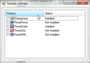
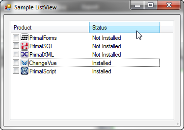
Sorted Columns:
ListView Help Function:
Here is a help function to add items to the ListView. It will handle the creation of ListViewItems for you.
function Add-ListViewItem
{

    Param(
    [ValidateNotNull()]
    [Parameter(Mandatory=$true)]
    [System.Windows.Forms.ListView]$ListView,
    [ValidateNotNull()]
    [Parameter(Mandatory=$true)]
    $Items,
    [int]$ImageIndex = -1,
    [string[]]$SubItems,
    [System.Windows.Forms.ListViewGroup]$Group,
    [switch]$Clear)

    if($Clear)
    {
        $ListView.Items.Clear();
    }

    if($Items -is [Array])
    {
        foreach ($item in $Items)
        {
            $listitem  = $ListView.Items.Add($item.ToString(), $ImageIndex)
            #Store the object in the Tag
            $listitem.Tag = $item

            if($SubItems -ne $null)
            {
                $listitem.SubItems.AddRange($SubItems)
            }

            if($Group -ne $null)
            {
                $listitem.Group = $Group
            }
        }
    }
    else
    {
        #Add a new item to the ListView
        $listitem  = $ListView.Items.Add($Items.ToString(), $ImageIndex)
        #Store the object in the Tag
        $listitem.Tag = $Items

        if($SubItems -ne $null)
        {
            $listitem.SubItems.AddRange($SubItems)
        }

        if($Group -ne $null)
        {
            $listitem.Group = $Group
        }
    }
}
Note: These helper functions are already included in PowerShell Studio.
We also created a sample form which demonstrates the ListView and column sorting. You can download the ListView sample.
For licensed customers, use the forum associated with your product in our Product Support Forums for Registered Customers.
For users of trial versions, please post in our Former and Future Customers - Questions forum.


