The Button Control
- Details
- Written by David Corrales
- Last Updated: 13 June 2016
- Created: 07 June 2011
- Hits: 48205
User Rating: 4 / 5


Button Control [System.Windows.Forms.Button]
Creates a clickable button. Used to initiate or end an action.
- MSDN Page: System.Windows.Forms.Button
- Default Event: Click
Important properties of the Button object
Important events of the Button object
Important properties
Text property: Sets the text on the button face
Use the Text property to get, set, and change the text that is displayed on the button.
Value type: System.String
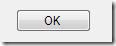
Default value: (button name, such as ‘button1’)
Note: PrimalScript and PowerShell Studio automatically rename the button when you set the Text property. For example, if you set the Text property to “OK”, the button is named “$buttonOK”.
To get the text on a button:
$text = $buttonTest.Text |
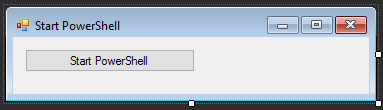
To set the text on a button, use an assignment statement. You can include variables and expressions in the assigned string value.
$Name = 'PowerShell' $buttonTest.Text = "Start $Name" |
To change the text on the button:
ButtonLoad_click = { # Get the text currently in the label and evaluate it. if ($ButtonTest.Text -eq 'Load table') { Get-Table $ButtonLoad.Text = 'Clear table' # Change the text in the label. } else { Clear-Table $ButtonLoad.Text = 'Load table' } } |
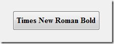
Font property: Determines the size and style of the button text
Use the Font property to change the style or the size of the text on the button, such as to emphasize or de-emphasize a button.
Value Type: System.Drawing.Font
Default: Microsoft Sans Serif 8.25
Tips:
- To set the font easily, in the Properties pane for the Button, in the Font row, click the ellipsis (…) and then use the Font selector.
- To automatically resize the button text to fit the button, set the AutoSize property to True.
To script a font change, set the Font property to a string with the Font name, size, and style.
$buttonStart, style=Bold, Italic' |
To determine other properties of the font, create a System.Drawing.Font object.
$ClickFont = [System.Drawing.Font]::new('Microsoft Sans Serif', 8.25, [System.Drawing.FontStyle]::Regular) $ClickedFont = [System.Drawing.Font]::new('Segoe UI', 16, [System.Drawing.FontStyle]::Italic) $buttonStart_Click={ if ($buttonStart.Text -eq 'Click') { $buttonStart.Text = 'Clicked' $buttonStart.Font = $ClickedFont } else { $buttonStart.Text = 'Click' $buttonStart.Font = $ClickFont } } |
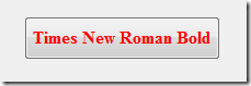
ForeColor property: Determines the color of the button text
Use the ForeColor property to get, set, and change the color of the text on the button.
Value type: [System.Drawing.Color]
Default: ControlText (Black)
To set the ForeColor property in a script:
$buttonOK.ForeColor = [System.Drawing.Color]::Red |
-or-
$buttonOK.ForeColor = "Red" |
Note: When the value of the FlatStyle property is System, the ForeColor, BackColor, Image, and BackgroundImage property values are determined by the operating system and cannot be changed.
Enabled property: Determines whether the button responds when clicked
Use the Enabled property to temporarily enable or disable the click feature of the button. For example, use Enabled = $false to disable the click feature after the button has been clicked or while a function is running.
Value Type: [System.Boolean] ($True, $False).
Default: $True
To completely disable the click feature of the button, omit the Click event handler or enter an empty script block.
To set the Enabled property in the script:
$button1.Enabled = $false |
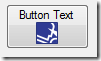
BackgroundImage: Places an image behind the button text
Use this property to display an icon, bitmap, or image of any type under the button text.
Value Type: [System.Drawing.Image]
Default: (None; Same as Form.BackgroundImage)
To add an image from a file to a button, use BackgroundImage property in the Property pane. Click the ellipsis and, in File Explorer, select a file. PowerShell Studio converts the file into a bitmap string (64-bit byte array) so it is independent of the local system.
To place an image over the button text (in the foreground), use the Image property of the button.
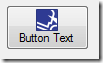
Image: Places an image over the button text
Use this property to display an icon, bitmap, or image of any type in the foreground of the button.
Value Type: [System.Drawing.Image]
Default: (None; Same as Form.BackgroundImage)
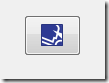
For example, this button has an image, but no text:
To add a image from a file, use Image property in the Property pane. Click the ellipsis and, in File Explorer, select a file. PowerShell Studio converts the file into a bitmap string (64-bit byte array) so it is independent of the local system.
To place an image under the button text, use the BackgroundImage property of the button.
Note: When the value of the FlatStyle property is System, the ForeColor, BackColor, Image, and BackgroundImage property values are determined by the operating system and cannot be changed.
TextImageRelation: Determines the location of the image relative to the text.
Use the TextImageRelation property to change the location of the button text so it doesn’t cover the image.
Value Type: System.Windows.Forms.TextImageRelation enumeration
Default: Overlay
Valid values are:
Overlay: Image and text share the same space
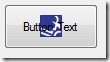
ImageBeforeText: Text appears to the right of the image
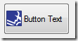
TextBeforeImage: Text appears to the left of the image
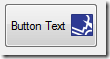
ImageAboveText: Text appears below the image
TextAboveImage: Text appears above the image
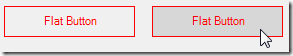
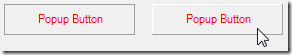
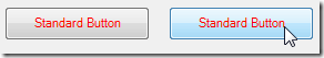
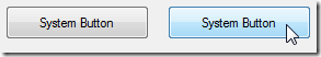
FlatStyle property: Determines how the control appears when a user mouses-over and clicks.
Use the FlatStyle property to change the response when the cursor focuses on the button.
Value Type: System.Windows.Forms.FlatStyle
Default: Standard
The FlatStyle property is effective only when the button is enabled. The effect of each value type is specific to the user’s operating system.
Note: When the value of the FlatStyle property is System, the ForeColor, BackColor, Image, and BackgroundImage property values are determined by the operating system and cannot be changed.
Valid values are:
Flat: The button appears flat. It changes color on mouse-over.
Popup: The button appears flat. When the mouse pointer moves over it, the button appears three-dimensional.
Standard: The button appears three-dimensional. It changes color on mouse-over.
System: Use the FlatStyle and colors of the user’s operating system.
DialogResult: Closes the form and tells the parent form which button closed it.
Use the DialogResult property to close a form and return a value [System.Windows.Forms.DialogResult] to a parent form (if any) that indicates which button was click to close the child form. For example, if the child form has OK and Cancel buttons, you can use the DialogResult property to tell the parent form which button closed the form.
This property closes the form, even when the form is not a modal (child) form.
Warning: When the DialogResult property has a value other than “None,” clicking the button closes the form. You do not need to write a Click event handler. If the button has a Click event handler, the form closes immediately after executing the Click event handler code.
Value Type: System.Windows.Forms.DialogResult enumeration
Default: None
Valid values include:
None (Default): The form does not close automatically. No value is returned to the parent form. The Click event handler determines the response of the button to a Click event.
OK: Closes the form and returns an OK value (usually sent from an OK button).
Cancel: Closes the form and returns a Cancel value (usually sent from a Cancel or X button).
Abort: Closes the form and returns an Abort value (usually sent from an Abort button).
Retry: Closes the form and returns a Retry value (usually sent from a Retry button).
Ignore: Closes the form and returns an Ignore value (usually sent from an Ignore button).
Yes: Closes the form and returns a Yes value (usually sent from a Yes button).
No: Closes the form and returns a No value (usually sent from a No button).
In this IF statement, the main form uses the Call-Childform_psf function to open a child form. When the child form closes, the main form tests for a DialogResult value of ‘OK’.
if (Call-ChildForm_psf -eq [System.Windows.Forms.DialogResult]::OK) { . . . } |
These statement show how to use DialogResult with a message box. The DialogResult of the OK button in the message box has a default value of OK.
The first command creates the message box and saves the DialogResult value in the $result variable. The IF statement checks for a value of OK in the result and proceeds accordingly.
$result = [System.Windows.Forms.MessageBox]::Show("Press OK to continue", "Question") if ($result -eq 'OK') { . . . } |
Important events
Click event: Occurs when the button is clicked.
Write a Click event handler that runs when the button is clicked. This is one of the most important events you will use when creating GUI applications.
Note: If you use the DialogResult property, the Click event handler run immediately before the form closes.
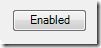
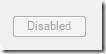
For example, the following Click event handler runs when the button is clicked. The button is disabled and the button text changes to “Disabled”.
$buttonEnabled_Click = { $buttonEnabled.Enabled = $false $buttonEnabled.Text = "Disabled" } |
Button before Click event:
Button after Click event:
Note about events:
To discover which control called the event script block, use the $this automatic variable. The $this variable is particularly useful when you have multiple controls calling the same event script block. The $this variable tells which control triggered the event, so you can respond in a control-specific way.
For example, this Click event script block disables the control that called it:
$Disable_Click={ $this.Enabled = $false } |
For licensed customers, use the forum associated with your product in our Product Support Forums for Registered Customers.
For users of trial versions, please post in our Former and Future Customers - Questions forum.